Squeeze King
Lemonade
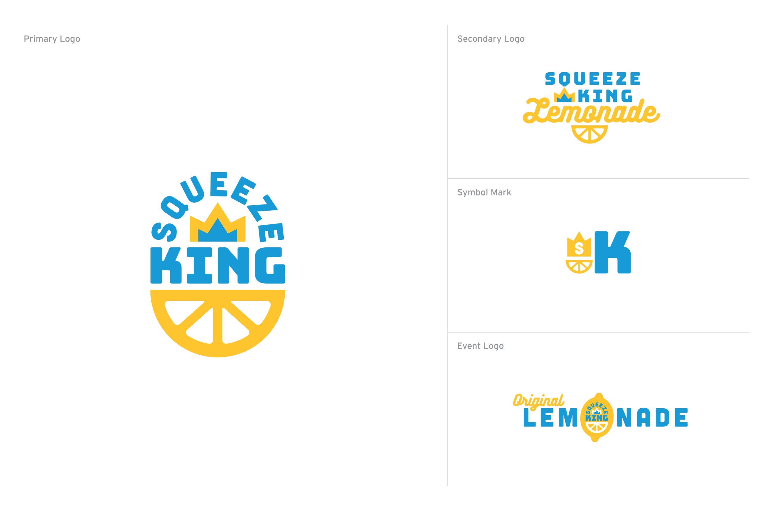
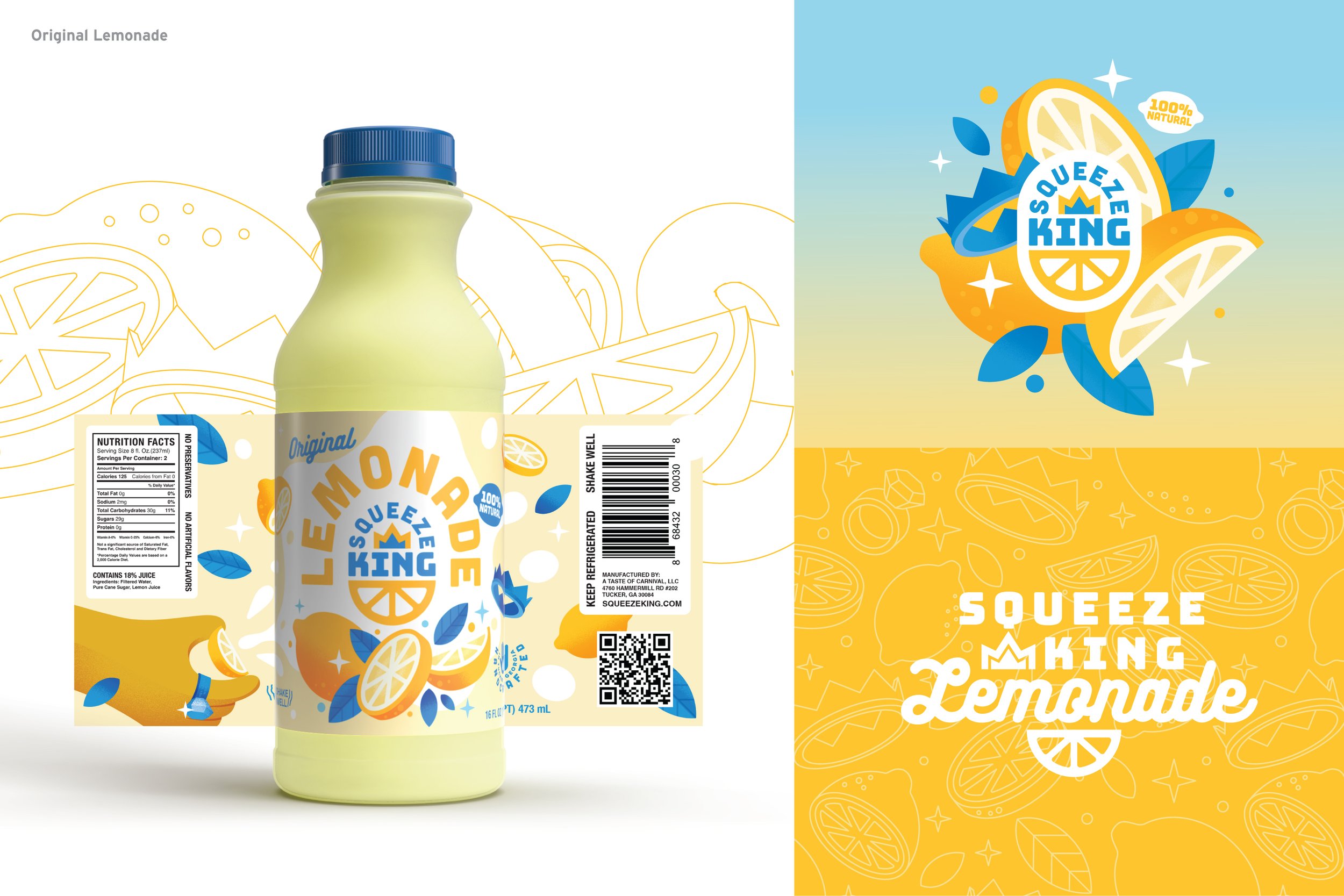
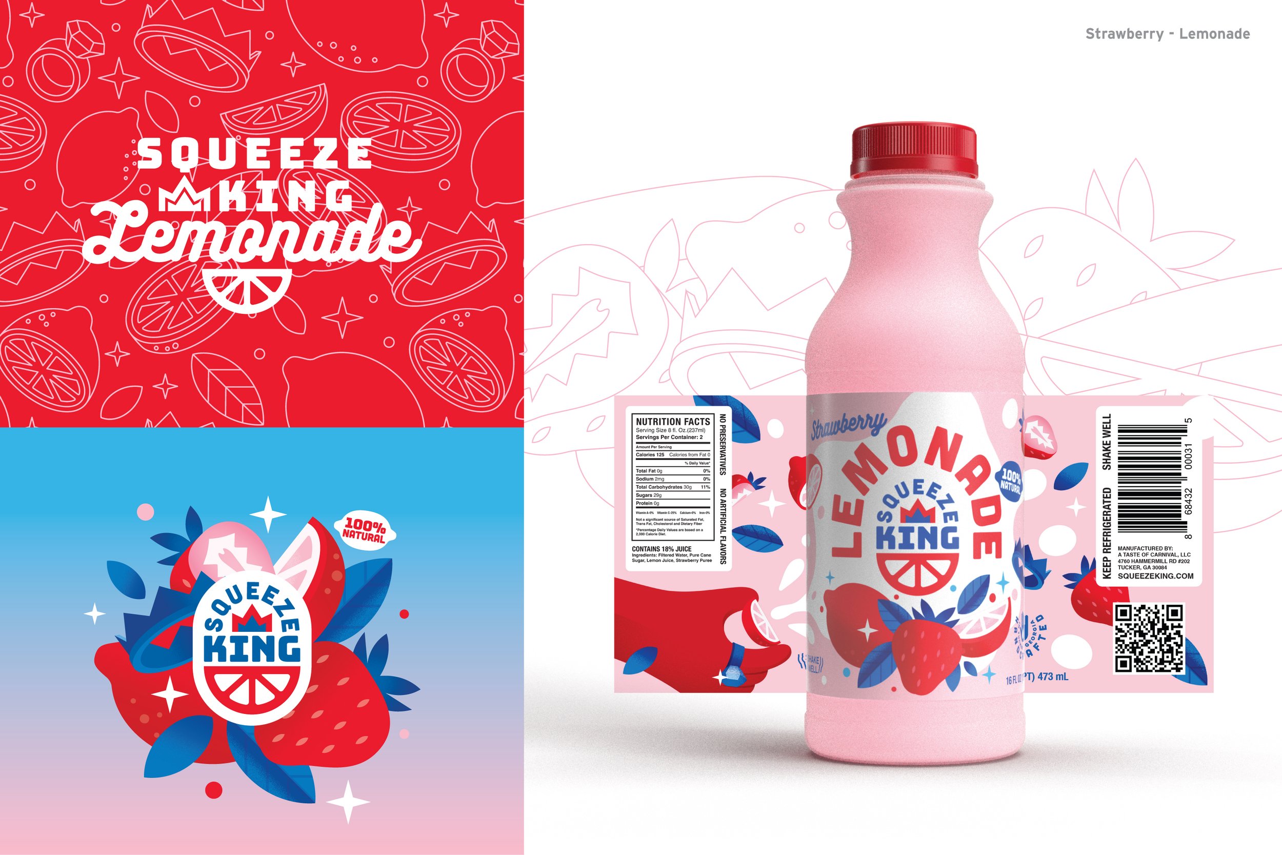
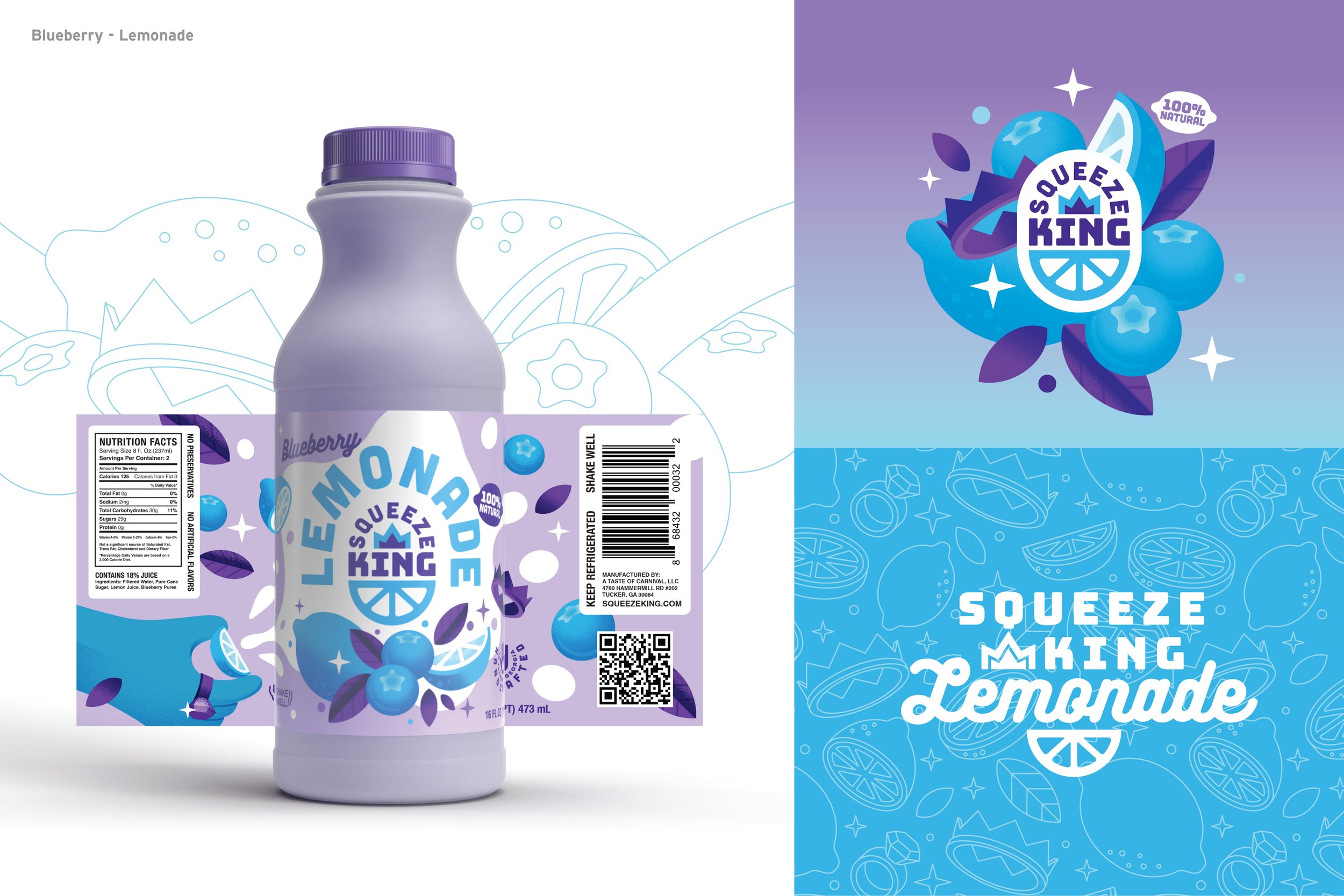
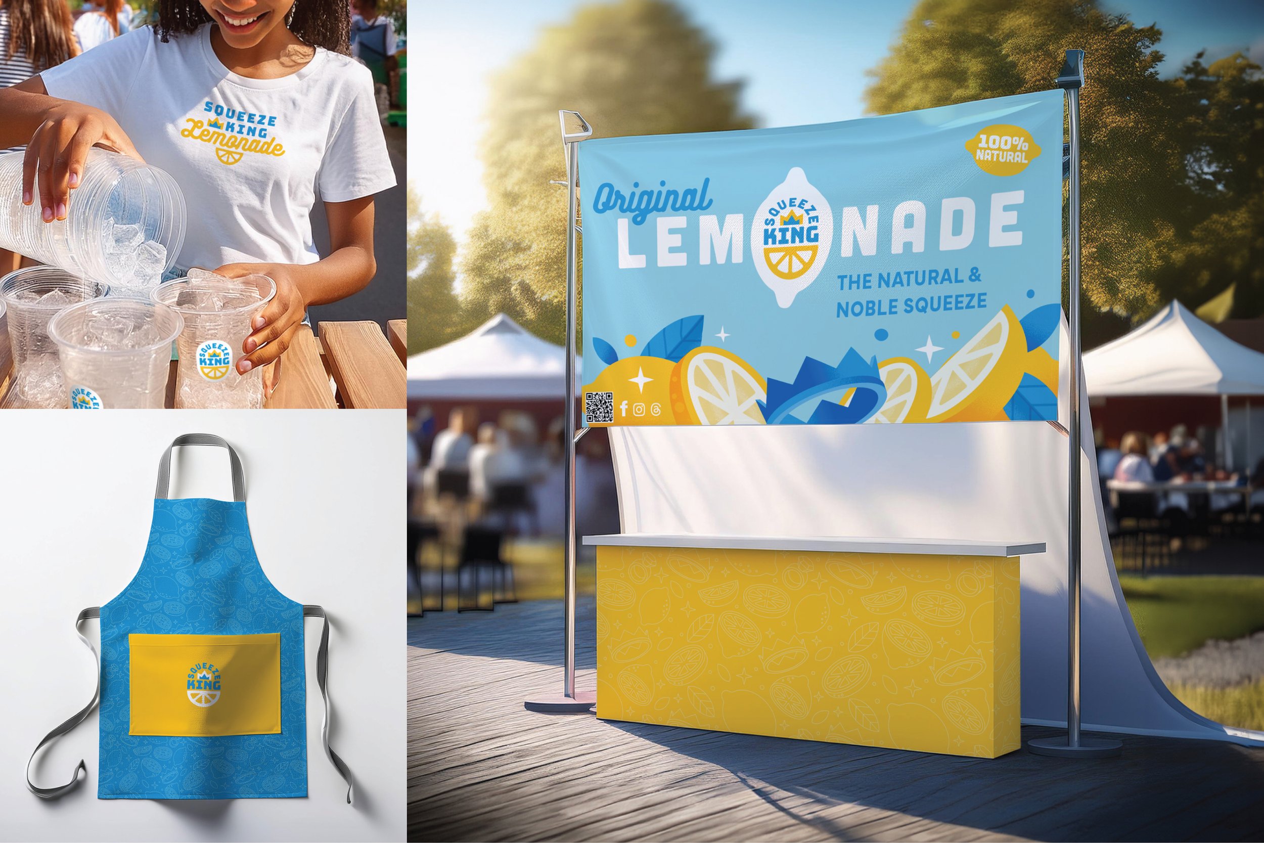
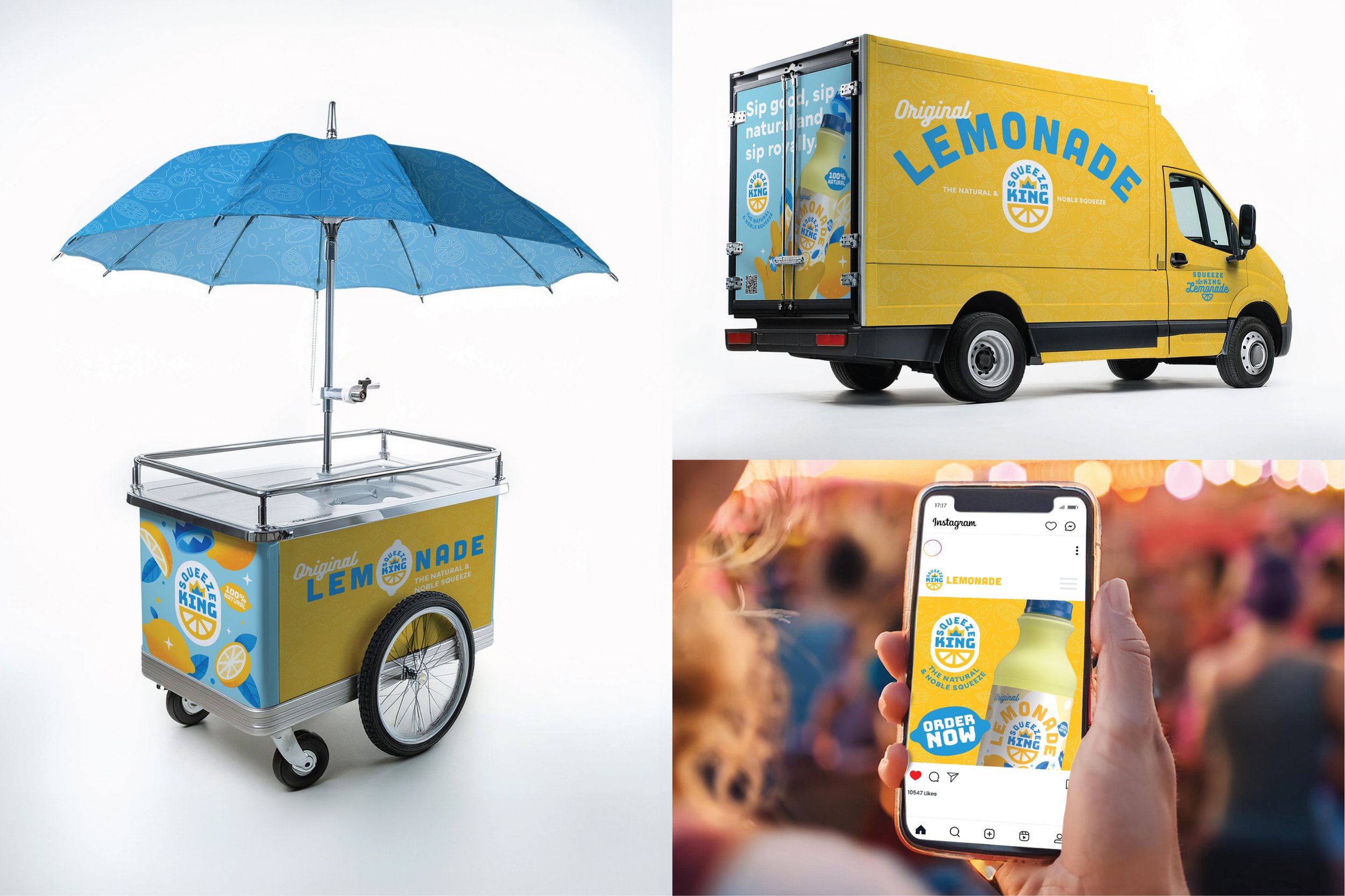
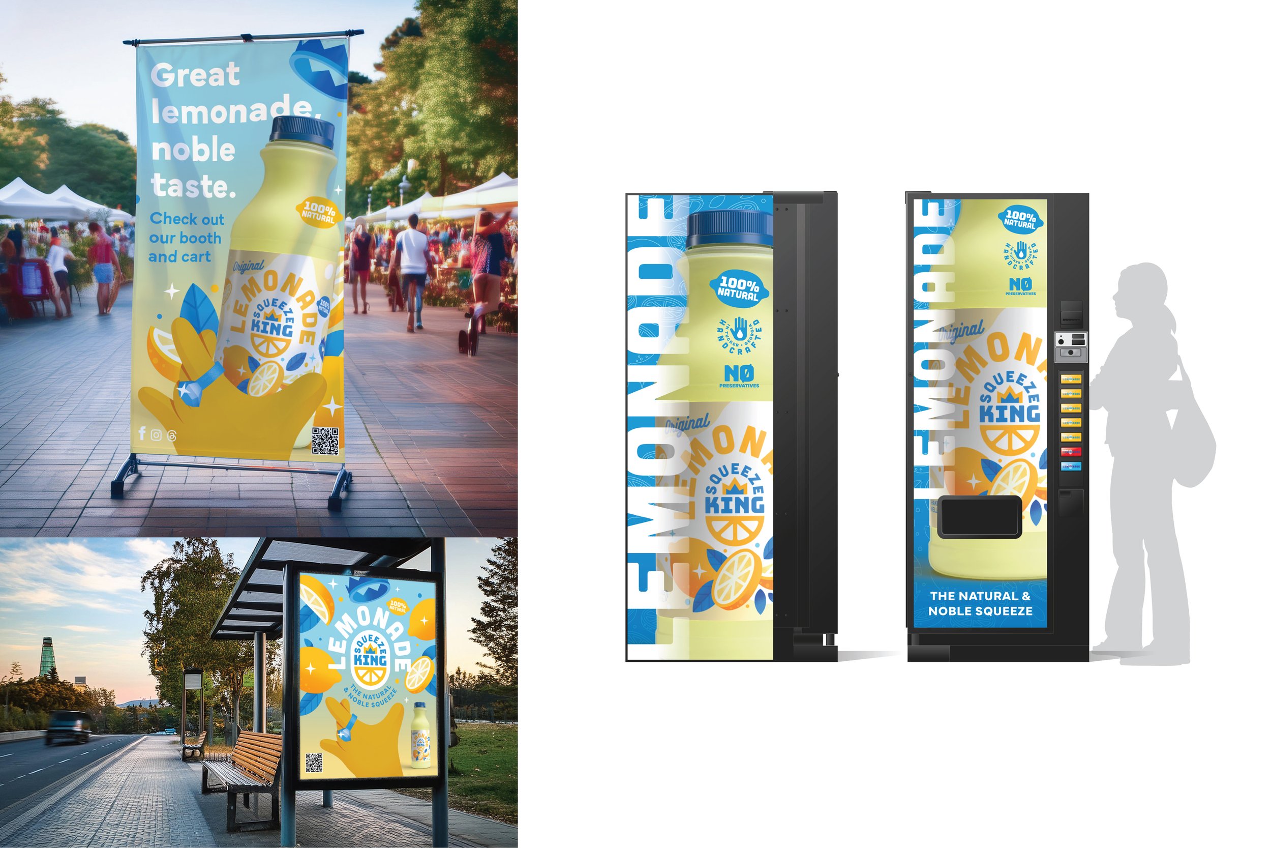
Squeeze King Lemonade’s new visual identity celebrates the nostalgic charm of small-town lemonade stands. Inspired by the purity and simplicity of childhood, the branding evokes a sense of hometown freshness and authenticity. The rebrand positions Squeeze King as a premium beverage brand rooted in Tucker, GA, while aspiring to compete on a national level.
CLIENT
Squeeze King
DATE
2024
LOCATION
Tucker, GA
SERVICES
Creative Direction
Logo/Identity
Branding
Design Development
Packaging
Environmental
Print Collateral
Illustration
Squeeze King Lemonade in Tucker, Georgia, faced issues with inconsistent branding that confused consumers with alcoholic drinks, impacting funding and retail partnerships. They also couldn’t use “fresh squeezed” in marketing.
PROBLEM
The company sought a brand identity that emphasized quality, versatility, and national positioning while celebrating local roots and handcrafted methods, especially as they considered focusing on distribution.
GOAL
The new brand identity was fun, approachable, and highlighted homegrown qualities, resonating with consumers and resulting in:
A surge in new customers supporting the local business.
Loyal customers embracing the new look.
A 30% sales increase at underperforming retail locations after updating packaging and P.O.P. materials.
This rebranding positioned Squeeze King Lemonade for future success and expansion.sought a brand identity that emphasized quality, versatility, and national positioning while celebrating local roots and handcrafted methods, especially as they considered focusing on distribution.
RESULTS